How did you use media technologies in the construction and research, planning and evaluation stages?
For this question I spoke from a prompt sheet and added appropriate imagery.
Sunday, 30 March 2014
Evaluation Question 2
How effective is the combination of your main product and ancillary tasks?
What we did, how did our research help ?
Our research was essential in the creation of our main product and ancillary task. Through our research we looked at the current bands work which included videos like Mr Brightside and Somebody Told Me, posters from as recent as 6 months ago and Digi-packs from the 10 years that they have been together. We also looked into their personalities by watching interviews and watching each one during a live performance. We wanted to understand the band as much as we could.
This helped us understand the style of the band, their attitude and the way they acted and this allowed us to film, direct and edit in their styles with ease.
Do they match?
Do our Digi-pack, Poster and Video all match and keep a consistent house style. I think that they do and thanks to our positive feedback our target audience also thinks that there is a consistent house style. We tried to keep a soothing sepia style which gives it s rustic feel which is an idea I got from the barn. I kept the brown colour, that is also often seen in the video. I also considered changing the black and white sections of the video to further match the two products but changing it to sepia didn't look to good and we made a decision that what the video looked like was more important. There is the pattern that I have put into parts of the ancillary task which also links them together. Its a small design tweak that I put in to make it different from just a normal Digi-Pack. I have also kept them in character for the shoot which helps keep the band a unity.
If they were mixed up with many other posters, CD's and videos could a complete stranger match them up together? I think so. Final Pieces
Do they compliment each other?
Are they all of the same level quality? Both the main product and ancillary tasks are both of a very high quality although to be honest the Digi-pack could have been made better and better suited to the video. The video is of an extremely high standard so to then create something reflecting that was always going to hard. All three pieces most definatly compliment each other you can see in the video that i created that all three fit together really well and there is a consistent house style through all three. If someone sees the poster, they wanna see the album, they see the album they then wanna see the video thats how it works.
inspiration ?
Our inspiration for the barn idea was quite coincidental to be honest. After listening to the song blindly for multiple times we came up with many ideas for a random live performance and the barn was one of the initial ideas. So we put barn on our list that we presented in our pitch and our teacher really supported the idea. We then made a mood board on which we placed some barns that we found on Google images and it just so happened to be that one of the images was a barn down the road in Canterbury that we would eventually end up hiring because it was perfect. The colours were just natural after filming at the barn we got into the rustic style. Most of our inspiration came from the actual band; The Killers and another band called All Time Low, which were both different in their own ways but we tried to merge them together and I think it worked well.
Design?
Font styles - Across the Digi-pack, poster and the video "the Killers" is written in their own personal font which is called; "Sam's Town", this was vital for the synergy of the multiple products. This gives all three pieces its own identity and separates it out from other bands.
Colours - As ive mention the sepia shades of brown are the main force of cohesion between the ree pieces. Through our research we found that colour is the best link through the three pieces.
Flatplans:
The flatplans were vital in designing the Digi-pack, helped us choose how it should be laid out in the best possible way so that it would compliment the other pieces. By flat planning we were able to choose specific points to which we could link our video with the other pieces. The flat plans we laid out where things would go, fonts colours and so on. Flat planning is very easy and quick way of planning.
Groupwork?
We both created digipacks and we were going to chose one and go through with that but after seeking advice we decided to go with our own digipacks. Sandhya would create her own to compliment the video and I would create my own.
Digipack
The digipack we created was a live album for the performance the band did of the album at the barn. This allowed us to give it our own name and be as creative as possible. The images on and in the CD and the poster really show the character of the band, especially the drummer, when the image was being taken they were told to pose but natural. The image on the poster is of the lead singer pulling the band which is oxymoronic because he couldn't actually pull the trailer.
Cross Promotion?
The images on the poster and the Digi-pack all taken at the barn linking them together therefore cross promoting each other.
I have created a video running the length of the video which includes three separate images which are the video, the Digi-pack and the poster to show how well they go together.
The promotion across all three pieces is very strong and they work a lot better together than they do individually.
The promotion across all three pieces is very strong and they work a lot better together than they do individually.
Evaluation Question 1
In what ways does your media product use, develop or challenge forms and conventions of real media products?
To answer this question me and Sandhya got together to discuss it and then we edited a video to match parts of the speech.
To answer this question me and Sandhya got together to discuss it and then we edited a video to match parts of the speech.
Wednesday, 26 March 2014
Digipack Original Photos
These are the original photos that I used for my Digi-pack including the pattern that I put over the CD.

Thursday, 20 March 2014
Digipack rough ideas - With Sandhya Gulsin
This is my first idea and initially my favourite idea from the off because it is very personal as the band are all over the digipack.
The second digipack that I made includes more of the character from the narrative part of the video.
Colour Adjustment - Sandhya Gulsin
When reflecting on the outcome of the rough cut, something that caught my attention was the clarity of footage. I wanted to create a "cinema" type affect as I believed it would add poise and power to our video. In order to attempt to edit the video producing the crisp clear footage, I had a lot to learn. The tutorial above shows the first part of the process in which I had to learn to use Premier Pro. By looking at these tutorials I was more able to use the program In which I had never used before.
The second part of the process was adjusting the colour of the different connecting clips so there was a colour balance between them. The three way colour corrector on Premier Pro allowed me to do this.
The third part of editing the colour was lowering the saturation to support the "rock" genre. The image captures below evidence the difference. After adjusting the colour I then was able to add the "Cinematic" affect. For the black and white footage I used "Cinematic 1" and layered it twice. From our previous feedback the use of sepia footage was proposed, so by doubling the affect, this adjusted the footage colour ever so slightly in between black and white and sepia. As the screen capture below shows, the footage clarity after colour editing is immaculate. For the rest of the footage I used "Cinematic 2" and when reflecting felt certain parts of the video still needed further editing as it seemed to overly edited resorting to parts looking too dark.
Strobe or No Strobe? - With Sandhya Gulsin
After receiving feedback on our rough cut, me and Jake decided that there was no place for the strobe lighting. Although the footage was very successful it had no place in our video. Our target audience agreed. The video below shows the outcome of some of the footage that will not be used in our final music video, but still plays a part in the process of trial.
Magazine Advert Analysis 5 - Sandhya Gulsin
This is the advert for the Kings of Leon album 'Only by the Night'. When seeing this poster I instantly noticed that the same image was used on the Album cover. This allows the audience to find a common link between the two. The same font is used throughout the poster showing consistency and I find this very simplistic yet visually appealing as the image maintains the viewers’ attention. The album name is placed under the image but supports its colours, suggesting the connection between the two. The image itself contains an illusion value combining sections of each band member’s face alongside what appears to be an owl. Owls are commonly known for being in there prime at night, both awake and aware. This links the title of the album to the imagery. Although the release date is placed at the bottom of the page its vibrant red colour will appear from afar to the audience.
Magazine Advert Analysis 4 - Sandhya Gulsin
My fourth advert Analysis is of Florence and the Machines Tour promotion poster. Although it doesn't focus on Album covers, I felt it was effective to evaluate the common links and differences between the two types of posters.The font used for “Florence + the machine” is the same font used in all of Florence and the machines album covers and posters, this shows a common trend to the target audience in which they are then likely to make links. The Cosmic Love tour is placed directly under in a different font showing the connection yet it stands out on its own. The text colour is white and maintains throughout. I feel this works well as it does not draw attention away from the main image. The main image shows Florence placed on a prop of the moon which is encouraged in the video of Cosmic love. It is very powerful in showing mystery and would link well visually to a cosmic world. The tour dates are shown below the image and contact numbers also are placed directly under making it only visible to see when close-up. This differs to an Album cover as the placement of dour dates and locations would normally be visual space or show respected critique reviews.
Magazine Advert Analysis 3 - Sandhya Gulsin
My third magazine analysis is of a personal favourite Poster promoting and album called Given to the wind by The Maccabees. This poster has a very simplistic approach for advertising. The bandname is presented in a very abstract format splitting "Maccabees" up in to the mould of a square. "The" is in very small print withing the M of the "Maccabees." Unlike the other Advert Analysis's this one has no image of the band but the image is of a graze field set alight. There is also a structure placed in the centre which almost represents a be-hive. It also visually links to the work by Andy Goldsworthy exploring structures created from the natural surroundings. Below the structure is the Album name and the release date. This is then followed by an Album review from NME. the NME crtique review complitely dominates the bottom of the page as there is nothing to follow after.
Magazine Advert - Sandhya Gulsin
For my first advert design I decided to go for a simplistic approach in which I was hoping would still be powerful and effective. From previously seeing the "Kings of Leon" advert I was inspired to split the 4 members of the band into quarters.
This is my second advert design, when reflecting I am unhappy with the 3 different fonts as I feel they do not work well together. If developed further this will be changed. The reason being why both initial advert designs have minimal writing is because I feel I need to collaborate with Jake and decide what the further information should be.
This is my second advert design, when reflecting I am unhappy with the 3 different fonts as I feel they do not work well together. If developed further this will be changed. The reason being why both initial advert designs have minimal writing is because I feel I need to collaborate with Jake and decide what the further information should be.
Day of Shoot
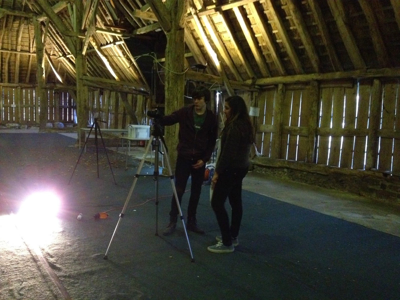
To get some proof that we filmed ourselves and how we did it we got someone to take images and film us filming.
Tuesday, 18 March 2014
Using Premier Pro
I used many tools and effects while using final cut.
These include:
The Razor Tool:
During the editing of our video in final cut I used the razor tool to cut the clips smaller if they needed to be after I had set in and out points. This is simply a tool that you hover over where you want to cut it and right click. You can then move or remove what clips you like.
Three Way Colour Wheel:
Using the three way colour wheel you can add different shades of colour to the clip to edit it.
You can change the overall shade from blues to
yellows.
Black and White:
The black and white feature worked perfectly on the narrative part of my video.
Alpha Adjusts:
The alpha adjust pretty much changes the transparency of the clip so you can overlay it over another clip.
ProcAmp:
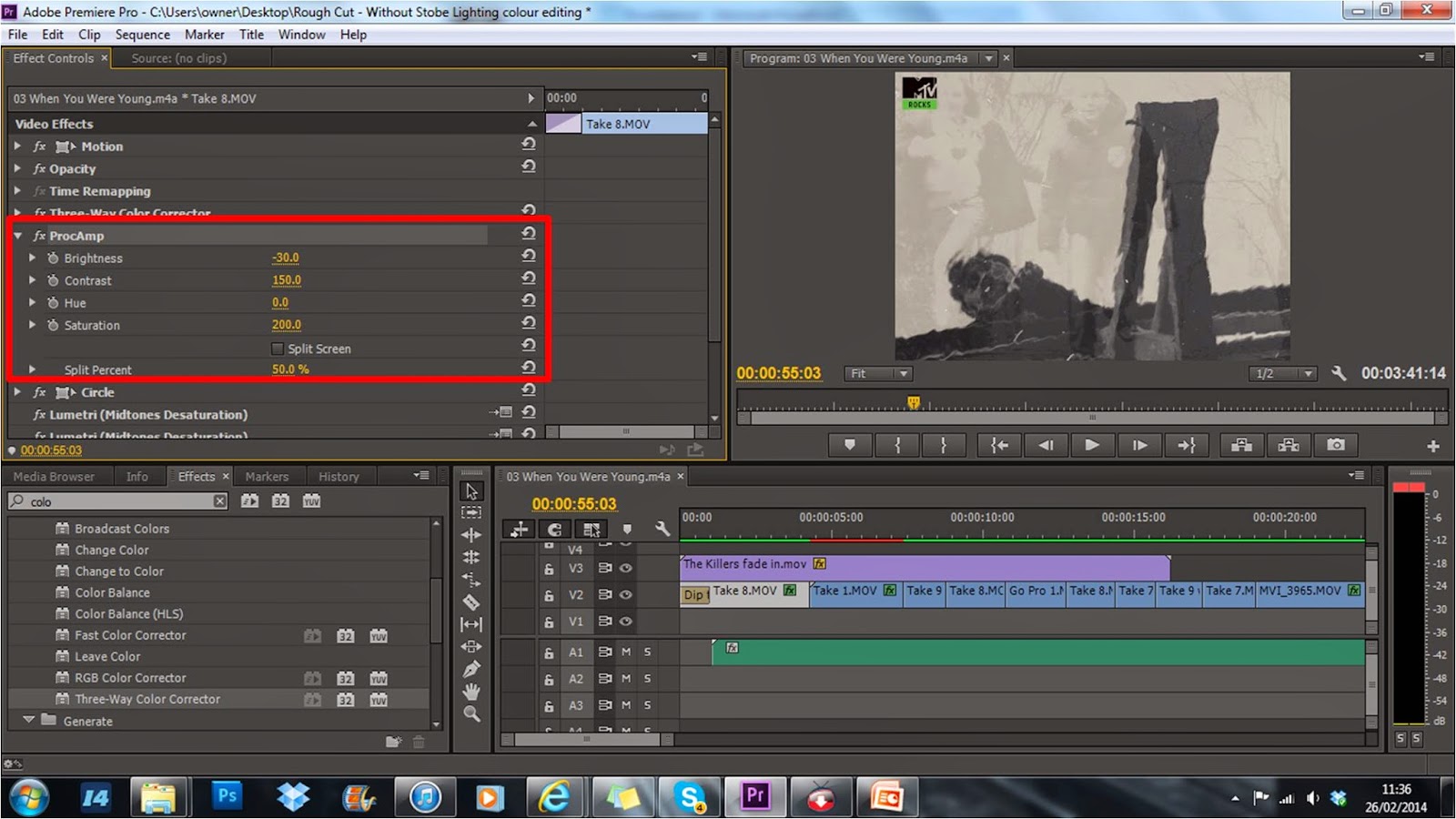
This allows you to change; The brightness, the contrast, the hue and the saturation. This can be useful if you have a clip that hasn't necessarily been filmed very well.
Circle:
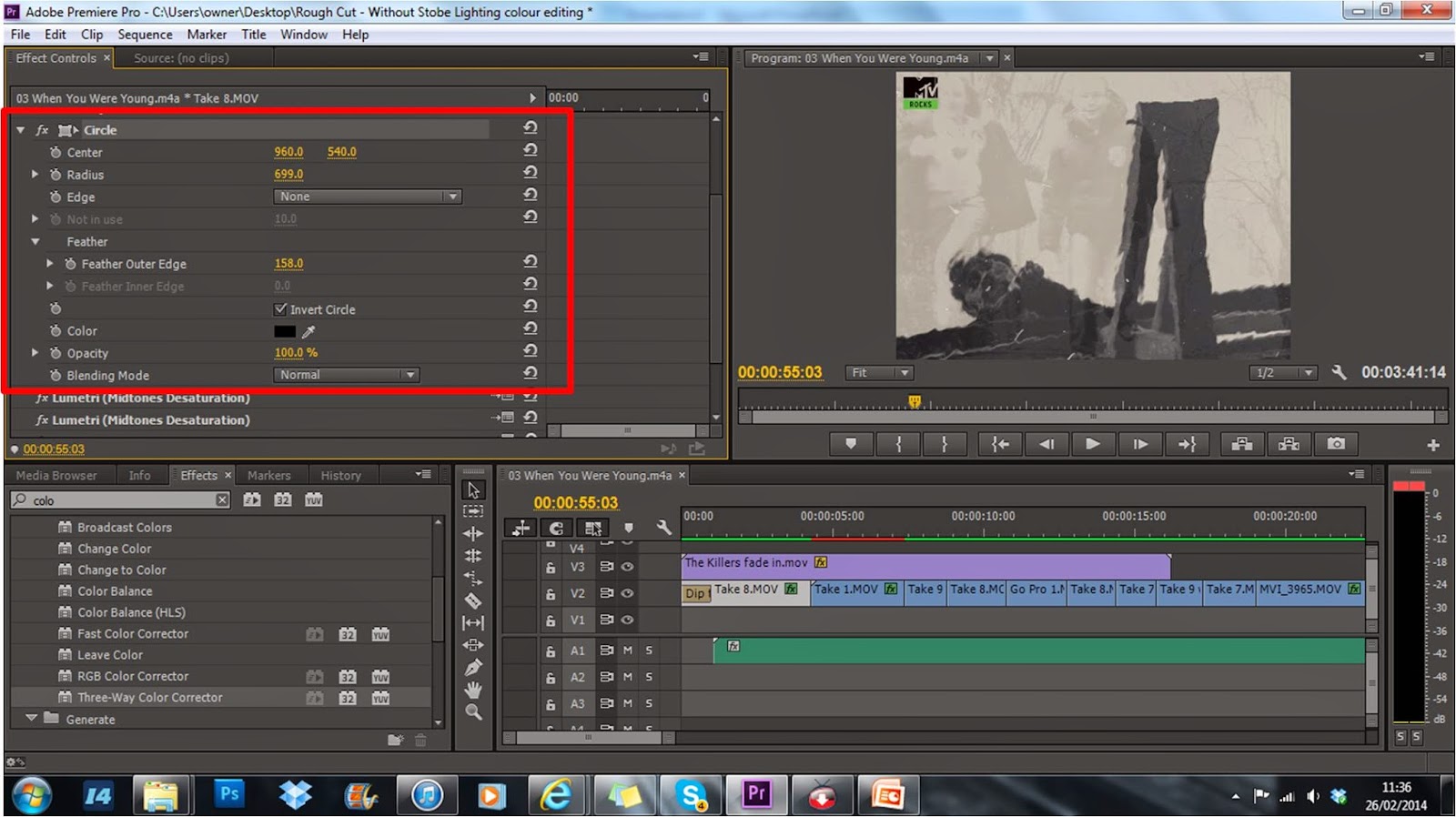 Circle allows you to darken the corners of the video or anywhere that you want because you can change the size of the "circle".
Opacity:
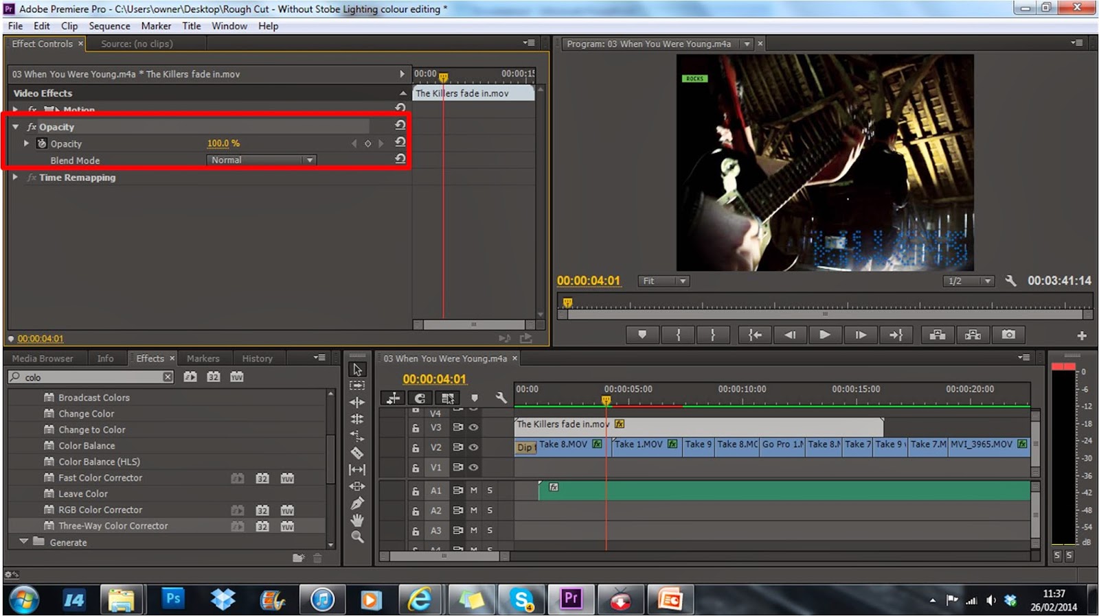 The opacity once again is a form of changing the transparency and I used it to fade in the title that I created and fade it out again.
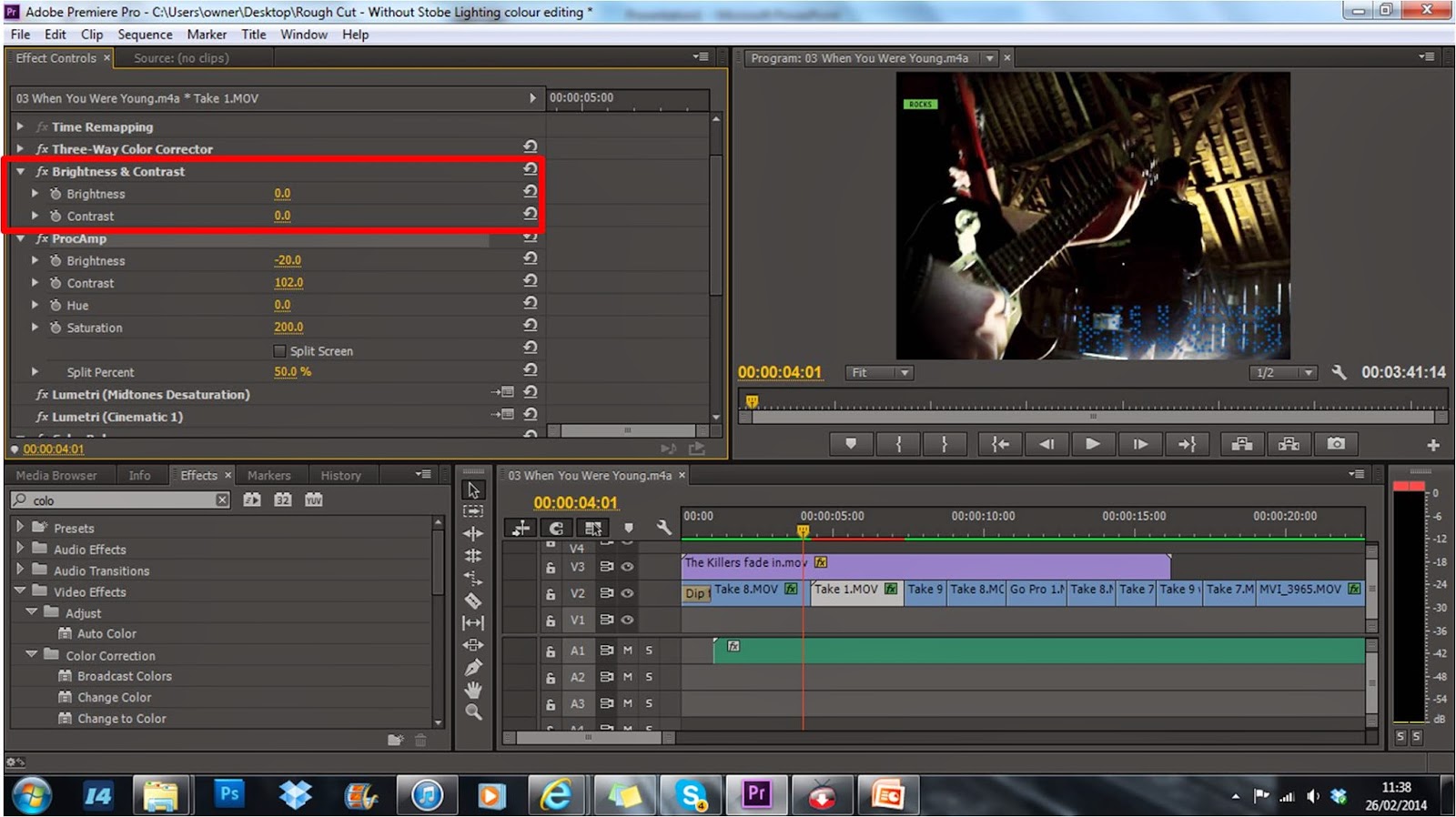 Brightness and Contrast:
This is different and easier to use than procAmp so I used it where I could.
Slide Tool:
The slide tool can be used to drag around the clips you have in your timeline.
These include:
The Razor Tool:
During the editing of our video in final cut I used the razor tool to cut the clips smaller if they needed to be after I had set in and out points. This is simply a tool that you hover over where you want to cut it and right click. You can then move or remove what clips you like.
Three Way Colour Wheel:
Using the three way colour wheel you can add different shades of colour to the clip to edit it.
You can change the overall shade from blues to
yellows.
Black and White:
The black and white feature worked perfectly on the narrative part of my video.
Alpha Adjusts:
The alpha adjust pretty much changes the transparency of the clip so you can overlay it over another clip.
ProcAmp:

This allows you to change; The brightness, the contrast, the hue and the saturation. This can be useful if you have a clip that hasn't necessarily been filmed very well.
Circle:
 Circle allows you to darken the corners of the video or anywhere that you want because you can change the size of the "circle".
Opacity:
 The opacity once again is a form of changing the transparency and I used it to fade in the title that I created and fade it out again.
  Brightness and Contrast:
This is different and easier to use than procAmp so I used it where I could.
Slide Tool:
The slide tool can be used to drag around the clips you have in your timeline.
Monday, 17 March 2014
Final Digipack
for our final digipack me and sandhya decided to come up with one idea each and then decide on the final one from there.
Below are my pieces of the digipack which includes the front, inside booklet, disk and back.
Subscribe to:
Comments (Atom)


